
What Is Power BI Dashboard And Why You Should Care
Today, the average business interacts with its audience using several platforms at once. Those include Google Ads, Facebook and Instagram, TikTok, and others. Thus, collecting all the data on channel performance is not easy. Some companies go with the manual or automatic aggregation of statistics in Excel or Google Sheets. This approach does not allow making the right decisions about optimization quickly. It takes a lot of specialists’ time and often does not provide transparency. Analytics is a key feature for modern business. A good analytics system allows you to increase your company’s performance. Harvard Business Review global survey showed some key benefits of using analytics. They include increased productivity, reduced risks and costs, faster decision-making, and superior performance.
So, now companies are making a choice in favor of preparing reports using BI systems. According to Akveo, one of the most famous and useful is Power BI.
What Is Power BI?
It is a line of Microsoft products designed to provide businesses with easy and transparent reporting. In total, it included seven products. They are Power BI Desktop, Power BI Services, Power BI Embedded, Power BI Mobile, Power BI Report Server, PBI Gateways. But to solve most of the tasks related to the analysis of progress, two will be enough:
- Power BI Desktop is a data-driven application and must be installed on your computer. With its help, you can connect data sources, structure them and build a visualized report with tables and charts.
- Power BI Services is a portal, cloud service, where all reports created in Power BI Desktop are published. The functions of this portal are rather administrative. With its help, for example, you can manage all reports in an organization and access them.
ALT: Black Power BI logo on the yellow background
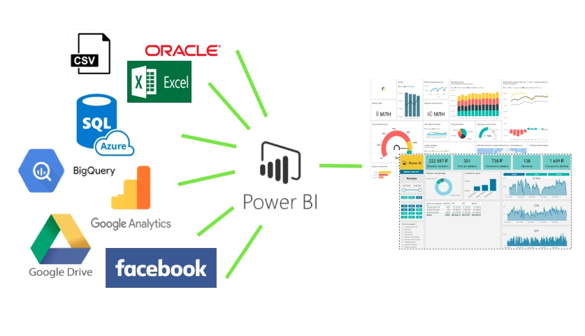
The way Power BI works is quite simple: data from various channels is transferred to the system using connectors. Then it is processed and visualized in a pre-prepared template – a bi dashboard. The output is a ready-made structured report that can be updated depending on the specified settings.
The generated report can be shared, embedded on the website, or used for monitoring. The system allows you to set up alerts on critical indicators and much more.
Possibilities of Power BI
Power BI can help you save a lot of time, effort, and money in reporting. Having set up its infrastructure once, the specialist will enjoy automatically generated reports for a long time. Yet, setting up and preparing the first report is not as easy as it might seem. Sometimes, you may need a programmer’s help to create connections to data sources that are not available by default. Or, to structure the information received.
It is important to note that for this reason, many companies use services with ready-made solutions. They help to avoid difficulties with connectors and data modeling. They also provide ready-made templates with a set of visualizations.
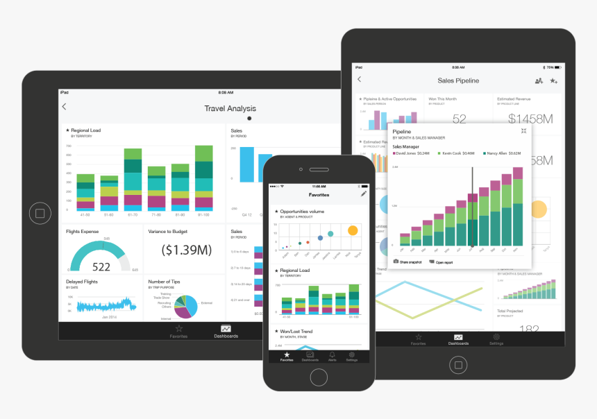
ALT: Two tablets and a phone with opened power bi dashboards
What other opportunities does Power BI provide? In fact, the list can be enormous. Here is an example of the most basic features:
- Collecting information from absolutely any data source. These can be various services, databases, folders, data from the Internet, API, and various other connectors. The Power BI team develops new ones and adds to the program every month;
- Processing of the received data, bringing them to a single form and standard. Combining and linking all these disparate tables into a single Power BI dashboard allows you to scoop up data about the state of the business;
- Development and modeling of your own formulas, indicators, and KPIs. This is used to control and analyze the necessary parameters of business management;
- Interactive visualization of all metrics, KPIs, tables in graphical form. That improves and speeds up the process of tracking and analyzing operational information;
- Presentation of all reports and bi-dashboards over the Internet through the Online Power BI Service or Mobile app;
- Separate access rights for employees;
- Using the server power of the Microsoft cloud to automatically process any amount of data;
- Automatic updates of all information hosted in the Power BI cloud, which allows you to receive up-to-date data in Power BI reports online;
- Automatic notification of the required employees by the system when critical values are reached in the specified KPI.
What Is a BI Dashboard?
The dashboard in Power BI is the final element not only in workspaces but in the overall architecture of Power BI. This is the semantic tip of all end-to-end analytics.
In brief, everything starts with disparate data, which are processed and combined into a single information model – data sets.
Then, based on this data, various reports are built, which we can visually combine on one canvas. A Power BI dashboard is a single canvas containing visualization tiles from different reports.
The meaning of all this is to display the main metrics for observation, comparison, and control within one monitor screen. And then, when you click on each metric, you can navigate to the corresponding expanded Power BI report and delve into all the many details.
Why Use Dashboards?
Dashboards are a great way to track your business, find answers, and review key metrics. Dashboard displays can be derived from base data sets or base reports. The dashboard combines on-site and cloud-based data to provide a unified view, no matter where the data is.
The control panel does not only look pretty. It is also quite interactive and easy to customize. Tiles are updated as the underlying data changes.
Among the other advantages of working with dashboards the most significant are:
- You don’t need to manually add data every time;
- All KPIs are visible on one screen;
- You can set the required refresh rate.
Of course, not all dashboards are equally good for your business. You need to choose the data wisely, as well as create bi dashboards that will really be useful. For example, you can see how to create a working delivery dashboard and the templates here.
The most frequent mistakes when making a bi-dashboard include putting too many details or elements. Also, not naming them properly or selecting a bad data display type.
Criteria for a good dashboard
The characteristics of a good dashboard include:
- Data visualization: You can quickly and easily see where ROI is dropping or which site is not suitable for your ad.
- The right context: at a glance, it is clear what the charts are about and what data is presented in the form of graphs.
- The ability to choose specific dates: you can easily change the reporting period in advertising campaigns.
- The interactivity of widgets: data can be filtered according to the selected parameter. For example, by country, city, device.
- Allows you to compare the selected indicators with the previous period. For example, to test the effectiveness of advertising campaigns.
- Allows you to track changes with the frequency you need, for example, sagging in traffic (once a day, a week, in real-time).
Thus, a good dashboard accurately represents information. While a bad dashboard is just a set of data that doesn’t provide a clear answer to your questions.